

Edinburgh Toile
Client : Edinburgh International Festival
Date : September 2009
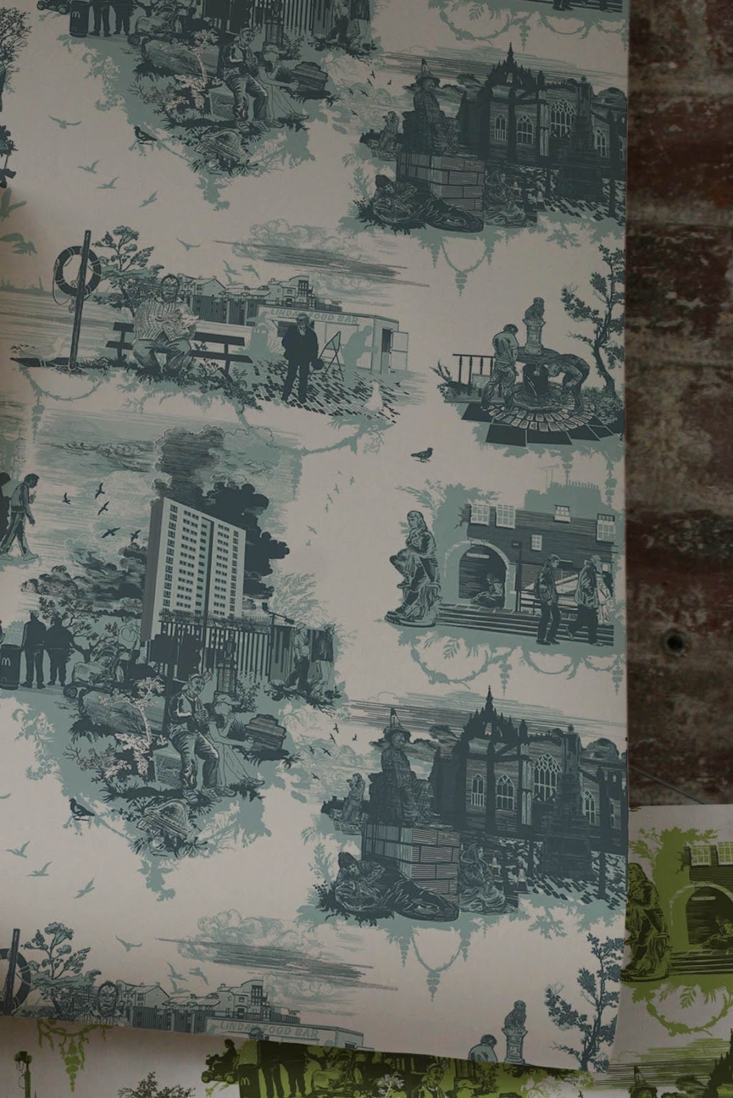
Edinburgh was added to Timorous Beasties' toile collection when the design was commissioned by theEdinburgh International Festival in 2009. The design was the cover of the EIF magazine for the event and also appeared on the Omni building in the city centre, a window in Jenners Department Store and on taxis and billboards across the city. The controversial images of traffic chaos, drunks beside Greyfriar's Bobby and a traffic cone on the statue of David Hume provoked strong opinion in more conservative circles.
http://www.timorousbeasties.com/projects/
Design by Timorous beasties


Timorous Beasties is the Scottish textiles and wallpaper label who have taken the concept of old fashioned toile and given it a twist. They have created an urban collection of toiles which reveal subverted scenes of modern day debauchery. Entitled London, Glasgow and Edinburgh, the prints touch on social and political themes in a most decorative way.

The complete 'Edinburgh Toile' as created by timorous beastie
To execute this story we chose to work with Timorous Beasties whose exploration of the ‘Toile’ style has seen them receive international praise and recognition for their surreal and provocative textiles and wallpapers. The final toile delivered this and much more in its depiction, challenging perceptions with its originality and creativity.
The urban landscape in many UK cities appears to be changing all the time. Iconic modern buildings give us a strong sense of identity and sit alongside monuments to great minds of the past, stunning period architecture and the practicalities and realities of a modern city. These provided a rich source for our ‘Edinbugh Toile.’ At first glance it looks like one of the magnificent vistas portrayed on early Toile de Jouy wallpaper, but closer inspection reveals a different vision of contemporary Edinburgh.

The toile revealed a different vision of contemporary Edinburgh
Elements of the design include iconic buildings St Giles’ Cathedral, Edinburgh Castle, the Scottish Parliament and Carlton Hill; historical figures including David Hume, James Boswell, Robert Burns and Greyfriars bobby; tour buses and tartan tourist shops; tramworks and roadworks; people going about their business, fast food caravans, homeless people, modern housing developments and a love of drink. EIF references included the Bank of Scotland Fireworks Concert, a firebrand conductor and ballet dancer incorporated into elements of the cityscape. It added an affectionate, frank and honest vision of modern Edinburgh for Festival 09.

Milan 08: textile and wallpaper designers Timorous Beasties will launch a collection printed with images of “contemporary urban life”, including skateboarders, tramps and CCTV cameras, and another design based on the conflict in the Middle East.

The Decouper Toile Collection (top, above and below) is based on 18th Century chinioserie and toiles de jouey patterns.

Bloody Hell (below) is ” an experimental wallpaper design based on the theme of war and conflict in the Middle East”.


Another designer updating the Toile de Jouy is London based artist and designer Julie Verhoeven. Having established a diverse career in the arts ranging from moving image to fashion illustration, she collaborated with renowned illustrator Peter Saville last year on a range of wallpaper entitled ‘Forget Me Not’. Starting with the traditional toile, their design took a more sexual and perversive stance with their prints showing images of Japanese bondage and pornography.
The beauty of Toile de Jouy is in the details. From afar it can appear chintzy and rather old fashioned but as many new designers are proving, the detail reveals very modern ideas.

The American interior designer Sheila Bridges has updated the Toile de Jouy by replacing the quaint rural scenes with those of everyday New York life. Characters dancing, playing basketball and carrying boomboxes make up this vibrant print which come in modern shades of yellow, robin’s egg, pistachio and cherry.

Paris based designer Manuel Canovas has produced a series of traditional printed wallpapers in acid tones and bright colours such as this bubblegum pink print below.

Back to the present, some “modern toile” plates with houses by the great Scottish design firm Timorous Beasties, who make amazing wallpaper and fabrics, but also china. Their “London Toile” pattern, while not exactly centered on a single house, certainly focuses on structures. Somehow it reminds me more of the eighteenth-century delftware than the nineteenth-century toile-like transferware, as does the Juliska “Country Estate” charger below.


Some scans from one of THE best books ever, Twenty-First Century Design by Marcus Fairs.

After Willow Ceramics by Robert Dawson
Ceramics

Glasgow Toile by Timorous Beasties
Textiles and Wallpaper
Both these products take traditional design and subvert them, using photomontage and copy and paste, as well as satire to bring them into the 21st century. I am interested in the idea of employing traditional crafts, such as quilting, but also making a product that is original and conceptual in our digital age.

Toile de Jouy
The inspiration of Timorous Beasties is this 18th Century French Wallpaper. Usually made of a white or off white background, with a highly complex pattern. The pattern colours are normally black, red or blue. Rarer ones are green, browns and magenta. The themes on these wallpapers are of what people did for fun back in the 18th century these were mostly playing in parks, picnics by the lakes and tea party's. Not only was Toile de Jouy wallpaper, it was bedding, cushions, curtains and other fabrics. The also include arrangements of flowers which are of the same or similar colours to the main pattern. I like the way this turns out as it really makes the pattern look very fancy. It is like the wallpaper of kings and queens, I think that this wallpaper would not look out of place in Buckingham Palace. I can see that Timorous Beasties drew a lot of inspiration from this style of wallpaper. Then turning it into something of a polar opposite, but still keeping the flowers and colours to distract you from the subject matter.
No comments:
Post a Comment