Zine
BACKGROUND
This project was done in less than two weeks in early February.
At that stage, I was doing my MA Project research, reading theory
and collating information and case studies.
my situation was, I was rejecting the Western theory -
'Orientalism', on the other hand, because of too much research collection, I do
not know how to narrow down and how to choose a point to do my experiment.
THE PURPOSE OF ZINE
This small project is to collect, sort and edit the key viewpoints
of one of my classmate’s research
outputs and communicate this as effectively as possible into a small
printed/hand made zine publication.
I did my partner Jinny’s project which is ‘Dream and
Artificial Intelligence’.
At first, we discussed each other's project and gave some advices.
It is really easy to find what the problem in other's project. On the contrary,
I was so confused about my owns project.
It was a good opportunity to stand on each other’s point of view to treat project and inspired from other
classmates idea.
Then I choose one point to do zine. Because my partner did not do a
lot research about AI. So, at first, I wanted to do something about AI. But I
was failed by drawing many different robots to represent dream, just like wire
frame.
I just think to illustrate what I thought. I did not chose one
version of the sequences to develop visually, and I did not considered scale,
tone, rhythm and aesthetics. The result frustrated me so much. In the day
workshop show, I suddenly found that I was not put myself on the role of “Graphic Designer” to design a zine.


THE CONCEPT
So I started to rethink again after the class seminar.
I choose ‘Brain waves’ to do my booklet, because ‘Brain waves’ is an interesting point to develop. I did some research on the
brain waves working when sleeping and awake.
I focus on ‘Dream Waves’, to give people a better understanding of brain waves
fluctuate during the day and night.
Different person have different dreams. Every dream has its special
wave and signal. Human’s dreams
can be constructed by memories and universe energy and also can be
deconstruction. It is like dimensional barcode.
I used white and black page to represent the day and night
respectively.
I thought about the zine’s form and typeface according to the brain waves waving. I tried to
deconstruct and reconstruct the typeface to combine with the graphic. At the
same time, I was thinking about the layout, paper stock and materials.
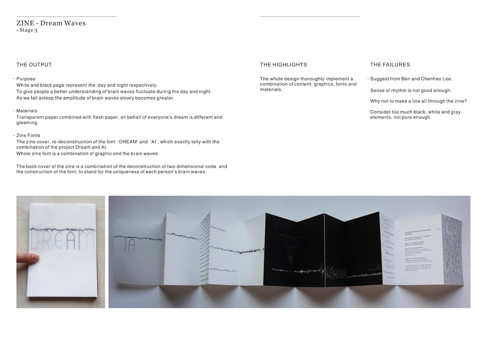
Materials
I chose transparent paper combined with flash paper, on behalf of
everyone's dream is different and gleaming.
Zine Fonts
The zine cover, re-deconstruction of the font ‘DREAM’ and ‘AI’, which
exactly tally with the combination of the project Dream and AI.
Whole zine font is a combination of graphic and the brain waves.
The back cover of the zine is a combination of the deconstruction
of two-dimensional code and the
construction of the font, to stand for the uniqueness of each person's brain
waves.
THE HIGHLIGHTS
The whole design thoroughly implement a combination of content,
graphics, fonts and materials.
THE FAILURES
Suggest from Ben and Chenhao Lee.
Sense of rhythm is not good enough.
Why not to make a line all through the zine?
Consider too much black, white and gray elements, not pure enough.

THE INSPIRATION
This font design video is excellent.
It gave me great inspiration about
the combination of the change in font and graphics.
WHAT I HAVE LEARNT
KEYWORDS
Switch / sort / key question / focus
When the project encountered a bottleneck, stop for a while, look
back to the starting point to sort out all of the research, and then stand on
someone else's point of view to look at my own work.
Listen and accept to my audience's comments and opinions, to get
advice and inspiration from them.
At last, critically think about my work , then choose my own way to
achieve it.
No comments:
Post a Comment